


Love Your Boobs
Originally developed as a digital painting, Love Your Boobs was reimagined as a playful, vector-based motion piece with a more focused message: check your boobs and love them too.
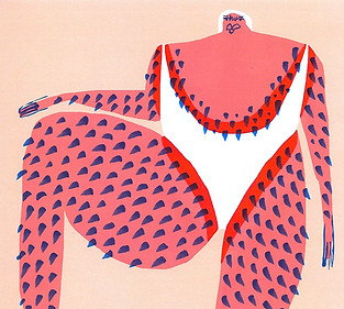
We were inspired by body-positive illustration and bold shapes, aiming to strike the right balance between serious subject matter and joyful expression.
The concept grew from a desire to turn something important into something shareable, motion that’s fun and cheeky.
According to the World Health Organisation, approximately 2.3 million people were diagnosed with breast cancer in 2022. It remains the most commonly diagnosed cancer among women, ranking as the leading cancer type in 157 out of 185 countries. While the numbers are sobering, early detection saves lives, and raising awareness remains essential.
This piece is a small and animated reminder to be aware, check in and share the message. We see it working as part of a social awareness campaign or charity advert, accompanied by a logo and a link to further info.
Concept Art in Photoshop
Designed in Illustrator
2D Animation in After Effects
Hand painted textures in Photoshop
Rigged, modelled and animated in C4D
Audio by Will Curry

Original artwork.
A cheeky animation with something important to say.
This is Love Your Boobs.


Matisse
Amber Vittoria
Jean Jullien
While developing Love Your Boobs, we explored artwork that used bold colour, simplified forms and expressive linework. We were drawn to styles that felt human, textured and unfiltered, such as artwork by Matisse, Amber Vittoria and Jean Jullien. With this creative approach the piece could carry a message without becoming clinical or overly serious.
This led us to visual references that celebrated curves, asymmetry and imperfection, often using flattened colour fields and playful composition. We brought that thinking into our own design through loose shapes, layered textures and a limited colour palette, aiming for something that felt honest and easy to connect with.